Archive for signs
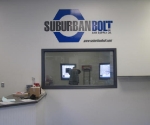
 In this project we helped an industrial fastener company “re-image” their fleet of vehicles located in 3 locations throughout the state and also adjusted various signage through their facilities to introduce a more cohesive look . For the vehicles, the challenge was to strip off the current graphics, – some as old as 9 years and apply new material so as to not to leave behind any shadow affect from the prior graphics. The other task was to convince the company that “less was more” in introducing the new logo design to their fleet. As you can see, in the prior design the customer had much more detail than what the new graphics evolved to. To deliver a “cleaner” look we eliminated excessive information like street addresses and phone numbers on each vehicle – which all can be readily accessed ... Read More
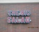
 For this project we designed this restaurants first foray into channel cut letters. In their prior location they had simple dimensional letters mounted to their storefront illuminated by floodlights so they were apprehensive about taking the next step. By checking out our “project” page you can track its progression from “can” cutting and forming, to lens creation, from LED placement to final sign installation. To deliver this project we secured city sign variances for size and placement. We can do the same for your next complex sign project, check out our testimonial page to see how pleased this customer was and how we can deliver similar results for you. ... Read More
Serving Warren, Grosse Pointe, Troy, Sterling Heights & Surrounding Michigan Areas
Copyright © 2024 All Rights Reserved
