Archive for fleet graphics
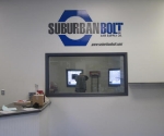
 In this project we helped an industrial fastener company “re-image” their fleet of vehicles located in 3 locations throughout the state and also adjusted various signage through their facilities to introduce a more cohesive look . For the vehicles, the challenge was to strip off the current graphics, – some as old as 9 years and apply new material so as to not to leave behind any shadow affect from the prior graphics. The other task was to convince the company that “less was more” in introducing the new logo design to their fleet. As you can see, in the prior design the customer had much more detail than what the new graphics evolved to. To deliver a “cleaner” look we eliminated excessive information like street addresses and phone numbers on each vehicle – which all can be readily accessed ... Read More
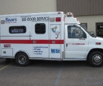
 In this project the goal was to exactly match factory installed graphics on an existing vehicle to new vehicles so as to create a unified fleet. This was accomplished by “gridding off” photos of the current vehicle and placing those in different regions along the new vehicle so as to ensure exact placement of new graphics up and down and left and right along the vehicle. When the ambulance was added to the fleet the key challenge was make sure all striping was accurately placed relative to existing vehicles in the fleet and aligned perfectly straight even around complex radiuses, body opening and closures. In addition the “stork” was designed to inject a little whimsy into the overall look. ... Read More
Serving Warren, Grosse Pointe, Troy, Sterling Heights & Surrounding Michigan Areas
Copyright © 2024 All Rights Reserved
