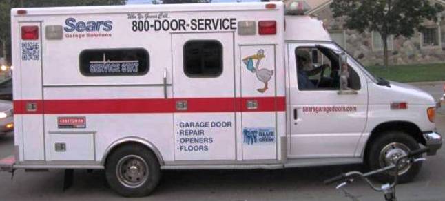
With the advent of digital graphics there are many decisions to make when it comes to having graphics or “wraps” applied to vehicles in your fleet. There are 2 types of graphics in use today, digital and vinyl. On the one hand vinyl graphics will deliver truer, deeper colors since their color is through and through in the “media”, but their use is limited in delivering gradients often referred to as a “fade” where the color tone of the material “fades” or varies along a range of points throughout the graphic. In addition, digital graphics can deliver more muted subtle color combinations that your logo or design theme may rely on whereas vinyl graphics cannot. Fades or gradients are typically an integral part of any vehicle “wrap”. In addition, digital graphics can deliver far more complex color combinations that may be needed throughout the graphics you desire than vinyl graphics ever will. In addition if the graphics you desire require photos only digital graphics can reproduce these. Due to the nature of their production characteristics the color of vinyl graphics is through-and-through the media whereas digital graphics are applied to neutral or white toned adhesive backed vinyl media using digital printing equipment. It’s these characteristics that tend to give more longevity to vinyl graphics versus digital graphics when both are exposed to the environment. At Majestic Sign and Design (MS&D) located in Warren, MI we can handle both media exclusively or even a blend of each. In the following designs and applications we used vinyl graphics exclusively because the BEST design could be achieved using that material;
Whereas in the following design we used a blend of digital and vinyl graphics;
For the flames, above the “running man icon” and the arrows shown above and below the company name-we designed gradient colors that vary in gradation throughout the graphic-so in this case we had to use digital graphics to achieve this look. However, for the remaining graphics on the truck we utilized vinyl graphics as they were designed from one single color of red, blue or black in this application.
In the same way the “fire & water” graphic seen below has a gradient in it requiring digital graphics, but the gold and blue lettering on this vehicle actually utilizes a blue shadow (outline) with the gold lettering is placed within the larger blue field behind the letter-in other words 2 sets of letters are used to achieve this look rather than digital graphics.
In the same manner the below graphic uses a combination of digital and vinyl
graphics because this customer wanted to emphasize a particular piece of specialized equipment (know as a “jetter” located in the top right corner of the truck panel side) they own that distinguishes them from their competition and only a photo of the equipment would do that justice.
Whereas the following graphic is 100% digital;
Digital graphics are needed in this instance to be able to portray all the images that we included in the overall design graphic especially the 3 dimensional images portrayed on the articulated rear door that are used to achieve depth of image. Note how it appears on the rear door that you could walk directly into that space and work?
One other thing of note in this particular graphic is how we managed to contain the overall size of the images on the side panels. The key to such an installation is hiding the material seams on a graphic this large. Since all sign making equipment has some upper level size parameter, you have to manage that in producing and applying graphics. In this case, if you look closely at the side of the truck there are actually 5 unique 1-piece graphic panels butted up against one another – each about 5’ in width. The challenge here is overlapping the graphics so the word text “messaging” never appears to be out of alignment or interrupted.
A major consideration to think about when choosing a company to design and install vehicle graphics is to make sure they have the capability to deliver a whole fleet of vehicles that you obviously want to be identical in appearance regardless of their size, shape or body style. As you can see below, Majestic Sign can do just that! In this case we delivered multiple quantities of unique vehicles with a common, consistent theme including regardless of vehicle type or size;
- So the next time you’re in the market to spruce up, replace, duplicate make-over or add to your fleet consider Majestic Sign & Design located in southeast MI for all your wrap and vehicle graphics needs. Whether digital, vinyl or an ideal blend of each Majestic Sign is your 1 stop choice for all your vehicle needs especially if you want to carry a common, consistent theme into and throughout your business across your entire road fleet. Oh yeah, 1 last thing, as you can see below, at 35 cents on a “cost per thousand impressions” basis vehicle graphics are the least expensive of all mass media marketing.


