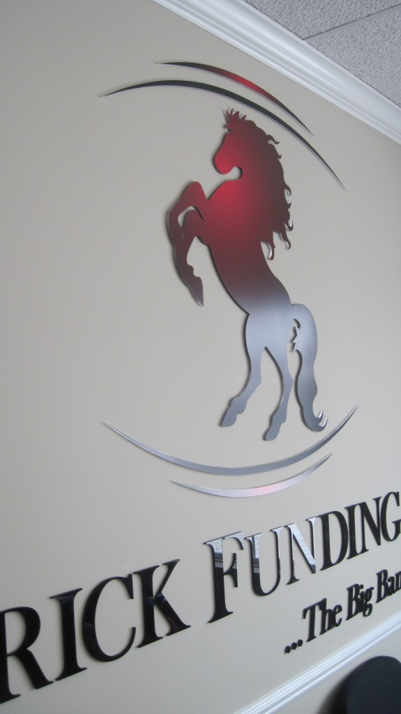
Maverick Funding Corp. is in the business of mortgage lending. Currently operating in 30 states, the mortgage lender offers FHA as well as Fannie Mae loan products. With an eye on customer service and personal attention to detail, Maverick works hard to differentiate itself from the big banks where mortgage lending has become an anonymous process.
When it came time to start shopping for a lobby sign that would be displayed in its Warren office, Maverick contacted Majestic Sign & Design. We visited the location and discussed the wide variety of available lobby signs. For Warren, and Detroit MI, brand awareness building, we suggested a sign that is made of dimensional acrylic letters and graphics that we affixed to the wall.
The logo of the lender is prominently displayed in the middle of the wall. It features the telltale colors of the national brand. Right below is the name of the company ad well as its trademark motto. We kept the signage above the midpoint of the wall, which ensures that even a sizable desk does not obstruct the view of the carefully worked acrylic.
 When choosing bank and financial institution lobby signs for your Warren and Detroit MI clients to see, consider the following:
- Material sets the tone. Acrylics give your lobby a contemporary feel. Metal laminate is more formal, which may be a good option for long-established financial institutions. Foam letter can be dressy. When fancy is in your vocabulary, foam might just be the right material to deliver on the look.
- Adapt your materials to match the furniture. If you have an already established lobby setting, choose your materials with an eye on the furniture that you have chosen. While metal laminate lettering works great with leather sofas and heavy dark woods, acrylics do not necessarily work so well in this setting. Of course, when you are going for the minimalist look with plenty of glass and metal, then both materials will do just fine. If you have favored the use of layered textures and colors, consider foam lettering that has been augmented with an acrylic facing or digital print. It not only fits right in but also helps to continue the interior decor scheme that you probably paid a pretty penny to affect.
- Go easy on the use of wall hangings. The wall that displays the logo sign should not be the same wall that features your print collection. The goal of the signage is the creation of a focal point. The majority of companies center a reception desk right underneath their lobby signs whenever this is feasible. Rather than crowding the wall with visual detractors, add some potted plants for ambiance. Carefully aimed spotlights are another great option that usually yields wonderful visual results.
We know that picking out the right lobby materials can be confusing. Our friendly graphic artists and installation technicians gladly take the time to visit your office for a closer look at the walls. Let us give you some ideas and help you think through all of your options before you make a decision. Contact today for a free quote!

