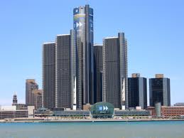
 The International Sign Association (ISA) reveals that the routine placement of exterior business signs is one of the reasons that they are so important to the consumer. As a result, you stand out – and not in a good way – without exterior signs. For Detroit businesses, this could mean the placement of monuments, post and panel signs as well as dimensional letter building markers.
Put Yourself in the Driver’s Seat of a Customer’s Car
Is it difficult to find the entrance to your parking lot? Place a monument sign! If you do not give shoppers the courtesy of identifying the easiest access to your parking lot before they drive past your venue and have to make a u-turn, there is a good chance that they will not spend the time and make that turn. To reel in traffic, you have to make the access to your front door as convenient as possible. In fact, when you focus on the right signage that makes identifying your place of business a simple task, customers might just choose to shop with you rather than go hunting for the competition that is harder to find.
Harmonize Your Signage Approach
 When you have a great façade with good-sized windowpanes, use the glass to your advantage. Identify the exterior of your parking lot with a monument sign, and place a lit channel letter sign above your doors. The windows may feature a wrap or tastefully done graphics and lettering. Yet be careful that you do not cram posters and other displays into the windows. This overdoes the marketing and makes your storefront look cluttered. Concise branding and marketing focuses on a central message.
Transition at the Front Door
When you are branding with exterior signage in Detroit, the interior of your venue should continue the theme but offer more information. Right at the door, the shopper has a last chance of turning away if she does not like the appearance. Create a focal point right inside the door that is of interest. A banner or a poster with a smaller typeface continues a marketing message that you started in big print on your exterior signage. A smaller end cap display sign offers more facts about the promised deal. For a service provider, it is the poster hanging near the receptionist’s desk that continues the marketing conversation in smaller print. It invites the customer to step closer and get more information.
Vary the Messages
 Some markers have a directional message. These are the big banners with the arrows pointing to your front door. Other signs advertise new products or services, sales or themed merchandise. You usually see them on banners, flags or posters. Yet no matter what nature your sign takes, always make sure to include your company name, logo and motto or tag line. This is particularly true when you use this information in TV advertising or in print ads.
If all of this sounds confusing, simply contact the friendly graphic artists at Majestic Sign & Design. We gladly sit down with you to map out a hard-hitting branding campaign as well as a comprehensive signage package that will make your place of business stand out. Contact us today for a free quote!
